
Buffalo is one of the most architecturally rich cities in the country. From the grand Victorians of Allentown to the sturdy Craftsman bungalows of South Buffalo, from Elmwood Village's charming row houses to the mid-century ranches scattered across Amherst and Cheektowaga, the housing stock here tells a real story. Choosing an exterior paint color isn't just about what looks nice on a swatch. It's about what works with your home's architectural style, what holds up against Western New York's brutal winters, and what makes your house look its best on a gray February afternoon and a bright July morning alike.
After years of painting homes across the Buffalo and Rochester area, we've learned a lot about which colors perform well here and which ones don't. This guide breaks down the practical side of choosing exterior paint colors for Buffalo's unique combination of climate and architecture.
Why Buffalo's Climate Matters When Choosing Paint Colors
Before we talk about specific colors, let's talk about what makes Buffalo different from, say, Phoenix or Charleston. The climate here puts serious demands on exterior paint.
Lake Effect Snow and Moisture
Buffalo averages around 95 inches of snow per year. That means your home's exterior is constantly dealing with freeze-thaw cycles, ice buildup along foundations and trim, and persistent moisture. Darker colors absorb more heat, which can actually help with snow and ice melt on sunny winter days. But they also expand and contract more with temperature swings, which can lead to faster cracking and peeling if the paint quality isn't up to par.
Gray Skies and Flat Light
Buffalo is one of the cloudiest cities in America. From November through March, overcast skies are the norm. Colors that look vibrant and warm in a sunny Southern climate can look flat and washed out under Buffalo's gray winter light. This is one of the biggest mistakes homeowners make: choosing a color from an online photo taken in California sunshine and expecting it to look the same on Hertel Avenue in January.
Summer Humidity and UV Exposure
Summers here are warm and humid, and the long daylight hours mean south-facing and west-facing walls get significant UV exposure from May through September. Reds and deep blues are particularly vulnerable to UV fading. If your heart is set on a bold color, plan on using a paint with strong UV-blocking pigments, and know that south-facing walls may need touch-ups sooner.
Color Palettes That Work With Buffalo's Architecture
Buffalo's neighborhoods have distinct architectural personalities. The best exterior color choices respect the character of the home and its surroundings. Here's what works well for the most common styles you'll find across the area.
Victorian and Queen Anne Homes
Buffalo has one of the finest collections of Victorian architecture in the country. These homes were originally painted in rich, multi-color schemes, and that tradition still works beautifully today. Consider:
- Body colors: Deep olive green, burgundy, mustard gold, slate blue, or warm terra cotta
- Trim colors: Cream, ivory, or a lighter shade of the body color
- Accent colors: Pick a third color for window sashes, door frames, and decorative brackets. Deep red, teal, or dark plum can highlight the ornamental details that make these homes special.
Victorian homes have lots of architectural detail, and a well-chosen three-color scheme brings that detail to life. Avoid painting the entire house one flat color. It hides the very features that give the home its character.
Craftsman and Arts & Crafts Bungalows
South Buffalo, Lackawanna, and many first-ring suburbs are full of Craftsman-style homes. These houses are all about natural materials, earthy tones, and a grounded, handmade feel. The best palettes lean into that:
- Body colors: Sage green, warm brown, deep taupe, forest green, or a rich ochre
- Trim colors: Warm white, dark brown, or a complementary earth tone
- Front door: A deep red, burnt orange, or dark teal adds personality without fighting the earthy palette
Craftsman homes look best in two-color schemes. The body and trim should feel like they belong together, with the accent limited to the front door and maybe the porch ceiling.
Colonial Revival and Four-Square Homes
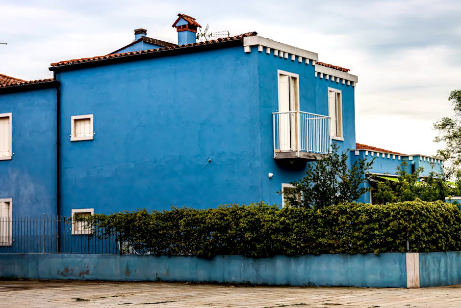
These are everywhere in Buffalo's residential neighborhoods. They're solid, symmetrical, and dignified. Traditional colors work best:
- Body colors: Classic white, soft gray, slate blue, colonial yellow, or a warm putty
- Trim colors: White or off-white for most body colors. Black or very dark green shutters add contrast.
- Shutters and doors: Black, hunter green, navy, or a bold red door for a pop of personality
If your Colonial has real working shutters (many in Buffalo do), make sure the shutter color contrasts enough with the body to read clearly. A gray house with slightly darker gray shutters just looks muddy.
Mid-Century Ranch and Split-Level Homes
The suburbs from Amherst to Hamburg are full of ranch homes built in the 1950s and 1960s. These homes have clean, horizontal lines and benefit from a modern approach:
- Body colors: Warm white, charcoal gray, soft olive, warm beige, or a muted blue-gray
- Trim and fascia: White, dark bronze, or black for a crisp, updated look
- Front door: This is where you can go bold. A bright yellow, coral, or turquoise door on a ranch home looks intentional and fun.
Ranch homes can look dated if painted in the same beige-on-beige schemes they've had since the 1970s. A fresh, slightly contrasting palette gives them new life without fighting the architecture.
Specific Colors That Perform Well in WNY
Here are some specific color recommendations based on what we've seen hold up and look great in the Buffalo and Rochester climate.
Whites and Off-Whites
White is a classic choice, but pure bright white can look harsh against snow and gray skies. Warmer whites work much better here:
- Benjamin Moore White Dove (OC-17): a warm, versatile white that doesn't look stark
- Sherwin-Williams Alabaster (SW 7008): a soft, creamy white with warmth
- Benjamin Moore Simply White (OC-117): clean but not cold
If you're considering a white exterior, make sure your trim offers enough contrast. All-white everything tends to disappear under overcast skies.
Grays
Gray has been hugely popular for the past decade, and it works well with Buffalo's stone and brick accents. The key is choosing a gray with the right undertone:
- Benjamin Moore Kendall Charcoal (HC-166): a rich, deep gray that reads well in flat light
- Sherwin-Williams Dorian Gray (SW 7017): a true mid-tone gray with balanced undertones
- Benjamin Moore Revere Pewter (HC-172): technically a greige, it's a safe and handsome choice for body color
Avoid cool, blue-leaning grays unless your home has warm brick or stone to balance them. Under Buffalo's overcast skies, a cool gray can feel almost blue and lifeless.
Blues and Greens
These are natural fits for WNY, where they complement the landscape and the frequent gray skies:
- Benjamin Moore Hale Navy (HC-154): a deep, classic navy that works beautifully on Colonials and Victorians
- Sherwin-Williams Pewter Green (SW 6208): a muted, sophisticated green perfect for Craftsman homes
- Benjamin Moore Newburyport Blue (HC-155): a slightly grayed-down blue that reads as elegant, not flashy
Warm Earth Tones
Earth tones feel completely at home in Buffalo's older neighborhoods:
- Benjamin Moore Cabot Trail (CC-12): a warm, rich brown ideal for Craftsman bungalows
- Sherwin-Williams Roycroft Suede (SW 2842): a deep, warm brown with Arts and Crafts roots (fitting, given Buffalo's Roycroft heritage in East Aurora)
- Benjamin Moore Brookline Beige (HC-47): warm and grounding without being boring
Practical Tips for Exterior Painting in Buffalo
Choosing the right color is only half the equation. Here are some practical considerations specific to painting in Western New York.
Always Test Colors on Your Actual House
Buy sample quarts and paint large swatches (at least 2 feet by 2 feet) on different sides of your house. Look at them at different times of day, in different weather. A color that looks perfect on a sunny afternoon might look completely different under overcast morning light. This is especially important here, where overcast conditions are your home's most common backdrop.
Timing Matters
The ideal painting window in Buffalo runs from late May through early October. You need consistent temperatures above 50°F (for most high-quality exterior paints) and low humidity. Early morning dew is common near Lake Erie, so experienced painters know to wait until surfaces are fully dry before starting. If you're planning a project in one of the communities east of Rochester like Victor, the season is similar but with slightly less lake effect interference.
Prep Work Is Everything
Buffalo's older homes often have layers of old paint, and moisture damage from decades of snow and ice. Proper scraping, priming, and repair work before a single coat of color goes on is what separates a paint job that lasts three years from one that lasts ten. This is true whether you're painting a century-old Victorian in Allentown or a postwar Cape Cod in Irondequoit.
Invest in Quality Paint
Buffalo's climate is hard on paint. Premium-grade exterior paints from Benjamin Moore or Sherwin-Williams contain better resins, more pigment, and stronger UV protection than budget options. The cost difference between a $35 gallon and a $65 gallon is tiny compared to the labor cost of repainting two years earlier than you should have to.
Don't Forget the Trim and Details
The trim color matters as much as the body color, maybe more. Trim defines the lines of your home and provides the contrast that makes everything look crisp. A freshly painted body with chipped, faded trim will still look shabby. For homeowners in neighborhoods like Brighton or Pittsford where curb appeal directly impacts property values, the trim and detail work is where the real payoff happens.
Color Trends vs. Timeless Choices
A quick word on trends. Right now, dark exteriors (black, very dark charcoal, deep navy) are popular nationally. They can look stunning, but there are a few things to keep in mind for Buffalo:
- Heat absorption: Very dark colors absorb significantly more heat, which accelerates expansion and contraction in WNY's wide temperature swings (from -10°F to 90°F through the year).
- Snow contrast: A black house with white snow piled against it is certainly dramatic, but dirt, salt splash, and ice damage show more readily on very dark surfaces.
- Neighborhood context: Buffalo's historic districts sometimes have design guidelines. Even where they don't, an all-black house on a street of cream and sage Victorians can feel jarring.
If you love the dark exterior trend, consider using it strategically. A dark body with lighter trim, or a dark accent wall on a covered porch, gives you the modern look without going all-in on a choice you might regret in five years.
Timeless colors, warm whites, classic blues, earth tones, and traditional greens, have looked good on Buffalo homes for a hundred years and will look good for a hundred more. When in doubt, lean classic.
How Your Surroundings Should Influence Your Choice
Take a walk around your block before you commit to a color. Notice what your neighbors' homes look like. You don't need to match, but you want to complement. A warm yellow home can look charming next to a gray neighbor but garish next to another warm-toned house.
Also consider your landscaping and hardscaping. If you have a red brick walkway, red-undertone paint colors might clash. If you have beautiful mature trees, a green body color could blend in too much during summer and look fantastic in winter once the leaves drop.
And don't overlook your roof color. The roof is a huge visual element, and your paint needs to work with it, not against it. A warm brown roof pairs well with cream, warm gray, or sage. A charcoal or black roof is more versatile and works with most color palettes.
Get It Right the First Time
Choosing an exterior paint color is one of those decisions that's easy to overthink, and also easy to get wrong if you rush. If you're painting a home in the Buffalo area, our residential painting team in Buffalo can help you think through color options that suit your home's style, your neighborhood, and the local climate. We bring actual color samples to your property so you can see them in context, not just under fluorescent lights at the hardware store.
We work across the entire Western New York region. Whether you need exterior painting in Penfield, a full color consultation for a Victorian in the city, or help refreshing a lakeside home in Webster, MLZ Painting handles every step from prep to final coat.
If you're ready to plan your next exterior paint project, or if you just want to talk through some color ideas before committing, give MLZ Painting a call at (585) 362-2190 to schedule a free estimate. We're happy to come take a look at your home, discuss what's working and what isn't, and help you land on a color scheme you'll love for years to come.
And if the exterior project has you thinking about freshening up the inside too, we handle interior painting throughout Buffalo and all of WNY. Sometimes a new exterior color inspires a whole new look inside as well.

Contact Us
Ready to Transform Your Space? Get a Free Estimate Today
Thinking about a new color? Planning a full repaint? We'd love to discuss your project and provide a free, no-obligation estimate.