
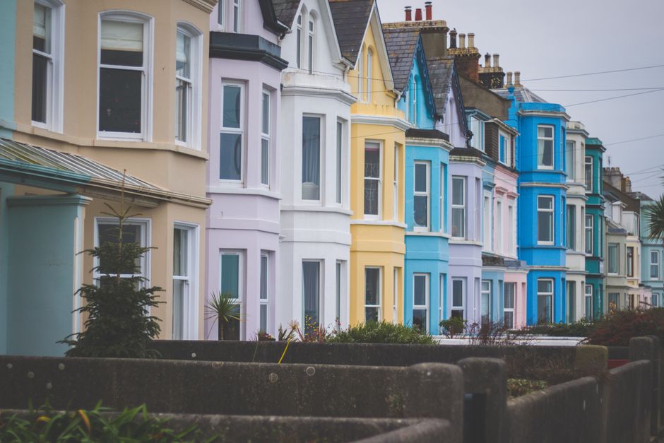
Choosing an exterior paint color for your home is one of those decisions that feels like it should be simple but never quite is. You want something that looks good on your house, holds up well in Western New York weather, and fits in with the homes around you. But you also don't want to end up with the same beige as every other house on the block. The good news is that "fitting in" and "standing out" aren't opposites. You can absolutely do both, and you don't need a design degree to pull it off.
Whether you live on a tree-lined street in Brighton, a historic block in Buffalo, or a newer development in Victor, the approach is the same. Start by understanding your surroundings, then make intentional choices that give your home its own personality within that context. Let's walk through how to do that, step by step.
Start by Reading Your Street
Before you crack open a single paint fan deck, take a walk around your neighborhood. Not a casual stroll, but a real study. Look at the homes on your street and the surrounding blocks with fresh eyes. You're looking for patterns.
- What's the dominant color family? Are most homes in warm tones (tans, creams, warm grays) or cool tones (blue-grays, greens, whites)?
- How much variation exists? Some neighborhoods have a wide range of colors, while others are very uniform. Both tell you something about what will work.
- What era are the homes? A street full of 1920s Craftsman bungalows suggests a different palette than a 1990s subdivision.
- What's the landscaping like? Mature trees, evergreen hedges, and garden beds all create a backdrop that affects how your color will read from the curb.
This isn't about copying your neighbors. It's about understanding the visual "language" of your street so you can speak it fluently while still saying something interesting.
Understand the Difference Between Blending and Matching
Here's a mistake we see often: homeowners think fitting in means matching. It doesn't. If every house on your street is some shade of gray, painting yours the exact same gray isn't fitting in. It's disappearing.
Blending means your home feels like it belongs in the neighborhood without looking like a clone. You achieve this by staying within a compatible color temperature and value range while choosing a distinct hue. For example, if your street leans toward warm neutrals, a sage green or a muted gold will blend beautifully without matching anything around it. The warmth ties it together, but the color itself is entirely your own.
On the other hand, if you're in a neighborhood of deep, saturated colors like the painted ladies in parts of Buffalo, a pale pastel might feel oddly out of place. Context matters more than any trend.
Work With Your Home's Fixed Elements
Your roof, your stone or brick accents, your foundation, your driveway, even your mailbox post: these are the things that aren't changing. Your paint color needs to work with all of them.
Roof Color
This is the biggest fixed element and the one people most often overlook. A warm brown roof and a cool blue-gray siding can clash in a way that's hard to pinpoint but always feels "off." If your roof is warm-toned (brown, tan, reddish), lean toward warm body colors. If it's cool (charcoal, black, blue-gray), you have more freedom, but cool or neutral body colors tend to look most cohesive.
Brick and Stone
Many Rochester-area homes have partial brick facades, stone foundations, or masonry chimneys. Pull undertones from these materials rather than fighting them. A home with orange-red brick looks great with a deep green, a warm cream, or a rich charcoal. It does not look great with a cool lavender.
Windows and Trim
If you're keeping existing windows, their frame color becomes part of the equation. White and black window frames are the most versatile. Tan or almond frames can limit your palette a bit more. If you're planning to repaint your home's exterior in Brighton or anywhere else in the area, it's worth considering whether the trim gets a fresh color too. Updating trim is one of the most impactful changes you can make.
The Three-Color Rule (And Why It Works)
Most successful exterior paint schemes use three colors:
- Body color: The main color covering the largest surface area (siding, stucco, etc.)
- Trim color: Used on window and door frames, fascia, soffits, and corner boards
- Accent color: The front door, shutters, or other small architectural details
This three-color approach gives your home visual depth without becoming chaotic. The body sets the tone, the trim frames everything, and the accent adds personality.
How to Distribute the Three Colors
Think of it as a ratio: roughly 60% body, 30% trim, and 10% accent. The body color does the heavy lifting of fitting into the neighborhood. The trim creates contrast and definition. The accent is where you get to be bold if you want to.
A classic example: warm gray body, crisp white trim, and a deep navy front door. It fits in almost anywhere, but the navy door gives it a point of view. Swap that door color for a bright yellow or a deep red, and you've got an entirely different feel from the same base palette.
Let's get specific. Here are several ways to add interest to your exterior without going off the rails.
Play With Undertones
A "gray" house can look completely different depending on its undertone. A gray with green undertones feels organic and earthy. A gray with blue undertones feels crisp and coastal. A gray with purple undertones feels moody and sophisticated. These are all "gray," and they all read as neutral from a distance, but up close they have real character. When we handle exterior painting projects in Pittsford, undertone selection is something we spend real time on with homeowners because it makes such a difference.
Use Contrast Strategically
Low-contrast schemes (like a medium gray body with a slightly lighter gray trim) look modern and sleek. High-contrast schemes (like a dark charcoal body with bright white trim) look bold and traditional. Neither is inherently better, but the level of contrast you choose dramatically changes how your home feels. If your neighborhood is mostly low-contrast, adding a bit more contrast to your scheme is a subtle way to stand out.
Don't Forget the Fifth Wall
Your front door gets called the "fifth wall" for a reason. It's the focal point of your entire facade. Even if you go conservative on the body and trim, a thoughtfully chosen door color can make your home memorable. Deep teal, warm terra cotta, classic black, or even a rich plum can work depending on your palette. This is the safest place to take a risk because it's easy to repaint if you change your mind.
Consider a Two-Tone Body
If your home has mixed materials (like shingle siding on the upper floor and clapboard below), you can use two related body colors to add dimension. A slightly darker shade on the lower portion grounds the house, while a lighter shade on top keeps it from feeling heavy. This works especially well on Victorian and Craftsman-style homes throughout the Rochester and Buffalo area.
WNY-Specific Considerations
Living in Western New York adds a few wrinkles to exterior color selection that you won't find in a generic "how to choose paint colors" article.
Gray Skies and Flat Light
Let's be honest: we get a lot of overcast days. Colors that look vibrant under bright sunshine in a paint store display can look flat and muddy under Rochester's cloud cover. This is especially true for medium-toned greens, blues, and grays. The solution is to test your colors on the actual house. Paint large sample patches (at least 2 feet by 2 feet) on different sides of your home and look at them at different times of day, including on cloudy days. What looks great at noon in July might look completely different on a gray October afternoon, and you'll be seeing it in October light far more often.
Snow as a Backdrop
For several months of the year, your home sits against a white background. Very pale colors can wash out against snow, while deeper, richer tones tend to look striking. If you're drawn to lighter colors, make sure your trim provides enough contrast to give your home definition even when there's two feet of snow on the ground. Homeowners considering exterior painting in Buffalo especially need to keep this in mind given the lake-effect snowfall.
Fading and Weathering
Our freeze-thaw cycles, road salt spray, and UV exposure in summer all affect how exterior paint ages. Darker colors tend to fade more noticeably than lighter ones, especially on south-facing walls. This doesn't mean you should avoid dark colors. It means you should use high-quality paint with strong UV resistance and plan for maintenance. A good paint job with proper prep can last many years, but color choice does affect how gracefully it ages.
Historic Districts and HOA Rules
If you live in a designated historic district (parts of the East Avenue area, the Susan B. Anthony neighborhood, Corn Hill, or similar areas), you may have guidelines or review processes for exterior colors. These aren't meant to be restrictive for the sake of it. They're designed to preserve the architectural character that makes these neighborhoods special. In most cases, historic guidelines actually give you more interesting options, not fewer, because they steer you toward historically accurate palettes that were far more colorful than people assume.
HOA-governed neighborhoods are a different story. Some HOAs have very specific approved color lists, while others just require approval before painting. Either way, check before you buy paint. It's much easier to get approval upfront than to repaint after a violation notice. If you're working with a professional team for residential painting in Victor or other suburban communities, they should be familiar with this process.
How to Test Colors the Right Way
This is where most people cut corners, and it shows. Here's the process that actually works:
- Start with 5-8 candidates. Grab paint chips or use a digital tool to narrow your initial list.
- Get sample pots. Most paint brands sell small sample sizes. Buy your top 3-4 choices.
- Paint large swatches on your house. Not on a board, not on paper. On the actual siding, in at least two locations (one sunny side, one shady side).
- Live with them for a few days. Look at them in morning light, afternoon light, dusk, and under cloud cover.
- Look from across the street. Colors shift with distance. What looks like a distinct blue-green up close might just read as "gray" from the curb.
- Check against your fixed elements. Hold the sample up next to your roof line, your brick, and your walkway.
This step takes a week and costs maybe $30 in sample pots. Compared to the cost of repainting your entire house because you don't love the color, it's the best investment you'll make.
Popular Exterior Color Families for WNY Homes
Based on what we see working well across the region, here are some color families worth considering:
Warm Whites and Creamy Neutrals
These work on almost everything, from colonials in Penfield to farmhouses in Livonia. The key is choosing a white with the right undertone. A stark, blue-white can look cold and institutional. A white with a touch of warmth (cream, linen, or greige-white) feels inviting and classic. If you're exploring options for exterior painting in Livonia, warm whites pair beautifully with the surrounding rural landscape.
Greens
From deep forest green to soft sage, green is one of the most neighborhood-friendly colors because it echoes the natural landscape. Sage greens are especially popular right now and read as a sophisticated neutral. Hunter greens work well on traditional homes and pair perfectly with white or cream trim.
Blues
Blue is tricky in our climate because it can look cold under gray skies. If you love blue, lean toward warmer blues (with a touch of gray or green) rather than pure or icy blues. Navy is a strong choice for accents or for bold homeowners who want a dark body color. Slate blue and dusty blue work well as body colors on Cape Cods and cottages.
Warm Grays and Greiges
The "greige" trend (gray plus beige) has been strong for several years, and it's sticking around because it genuinely works in our environment. It reads as modern without being stark, and it complements both warm and cool fixed elements. Just make sure your greige doesn't lean too pink or too purple, which can happen with certain formulations.
Deep, Rich Tones
Dark colors like charcoal, deep olive, dark navy, and even black are increasingly popular on homes throughout the area. They make a strong statement and photograph beautifully, but they do absorb more heat and show fading more quickly. If you're considering a dark body color, talk to your painter about the best products to use. Quality matters even more with deep colors.
What About Resale Value?
If you're planning to sell in the next few years, color choice becomes a bit more strategic. Data consistently shows that homes with neutral exterior colors (whites, grays, greiges, and tans) sell faster and for more money on average. That doesn't mean you have to go bland. It means your body color should be broadly appealing, and you can express personality through your accent choices.
That said, if you plan to stay in your home for a long time, paint it a color you love. Paint isn't permanent. A future buyer can always repaint, and they likely will regardless of what color you choose. Don't spend a decade looking at a beige house when a slate blue one would make you smile every time you pull into the driveway.
The Value of a Professional Eye
Sometimes you just need another opinion, and not from your neighbor or your cousin. A professional painter who works on homes every day has seen hundreds of color combinations on real houses in real conditions. They know which colors look great on paper but fall flat on siding. They know which products hold up best in our climate. And they can spot potential issues (like clashing undertones or insufficient contrast) before you commit.
If you're also thinking about refreshing the inside of your home, the exterior and interior color palettes should feel related, especially in the entryway and rooms visible from the front door. Coordinating interior painting in Victor or anywhere in the area with your new exterior creates a cohesive feel that makes the whole home feel intentional.
Ready to Choose Your Color? Let's Talk.
Picking an exterior color is a big decision, but it doesn't have to be stressful. At MLZ Painting, we help homeowners across Western New York work through exactly this process. We'll look at your home's architecture, your neighborhood, your fixed elements, and your personal preferences, then help you narrow down a palette that checks every box. Whether you need exterior painting in Lima, a fresh look for your home in Clarence, or you're anywhere else in the Rochester and Buffalo area, we'd love to help.
Give us a call at (585) 362-2190 to schedule a free estimate. We'll come out, take a look at your home, and have an honest conversation about what will work best for your house, your street, and your style. No pressure, no gimmicks, just good advice and quality work.

Contact Us
Ready to Transform Your Space? Get a Free Estimate Today
Thinking about a new color? Planning a full repaint? We'd love to discuss your project and provide a free, no-obligation estimate.