
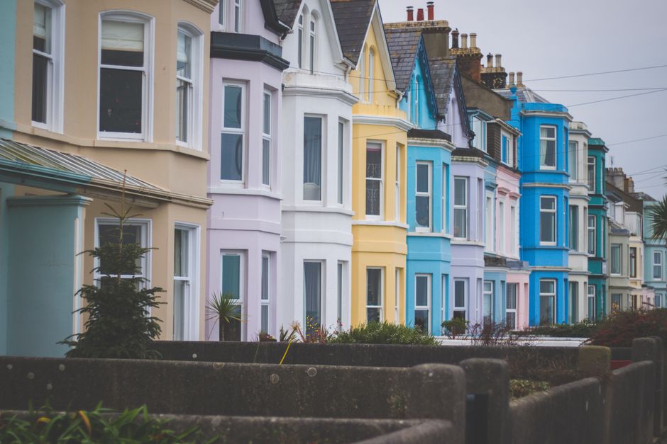
Western New York is home to some of the most beautiful Colonial and Victorian architecture in the country. Drive through the neighborhoods of East Avenue in Rochester, Elmwood Village in Buffalo, or the tree-lined streets of Pittsford and Brighton, and you'll see stunning examples of these classic styles everywhere. Choosing the right color combination for one of these homes is a big decision, and it's one that can either honor the home's character or work against it.
Whether you own a stately Colonial Revival, a Folk Victorian, a Queen Anne, or an Italianate, this guide will walk you through the most popular and historically appropriate color combinations we see working well across the WNY region.
Understanding the Difference: Colonial vs. Victorian Color Palettes
Before diving into specific combinations, it helps to understand that Colonial and Victorian homes call for very different approaches to color.
Colonial Homes: Restrained and Classic
Colonial architecture, including Georgian, Federal, Dutch Colonial, and Colonial Revival styles, favors a more restrained palette. These homes were originally painted in colors that could be made from natural pigments: deep reds, muted yellows, slate blues, and earthy greens. The look is dignified and balanced. Typically, you're working with just two or three colors: one for the body, one for the trim, and sometimes a third for the shutters or front door.
Victorian Homes: Bold and Multi-Toned
Victorian homes are a different story entirely. The Victorians loved ornament, and they used color to highlight it. Queen Anne, Second Empire, Stick, and Eastlake styles were designed to show off their intricate millwork, gingerbread trim, brackets, and fish-scale shingles. It's common and historically correct to use three, four, or even five colors on a Victorian exterior. The goal is to pick out each architectural detail so it stands on its own.
If you're planning an exterior painting project in Brighton or anywhere else in the Rochester area, these are some of the Colonial color schemes that work especially well in our region.
1. Classic White Body with Black or Dark Charcoal Shutters
This is the combination most people picture when they think of a Colonial home, and there's a good reason it has endured for centuries. A crisp white body (Benjamin Moore's Simply White or Sherwin-Williams Alabaster are popular choices) paired with jet black or deep charcoal shutters gives a clean, timeless look. Add a red or navy front door for a subtle pop of personality.
This combination holds up beautifully against WNY's mix of green summers and snowy winters. White siding photographs well in all seasons, and dark shutters provide strong contrast that reads well from the street.
2. Warm Cream Body with Deep Green Trim and Shutters
For homeowners who want something a bit softer than stark white, a warm cream or pale buttercream body paired with hunter green or forest green shutters is a wonderful choice. This palette has deep roots in the Colonial era and looks particularly handsome on homes surrounded by mature trees, which describes half the neighborhoods in Rochester and the surrounding suburbs.
3. Slate Blue Body with White Trim
A dusty slate blue, sometimes called Williamsburg Blue, is a historically accurate and increasingly popular choice for Colonial homes in WNY. Paired with bright white trim and darker navy shutters, this combination feels fresh without straying from tradition. It works especially well on clapboard siding and looks right at home in villages like Pittsford, Fairport, and Geneseo.
4. Barn Red or Federal Red Body with Cream Trim
This combination draws on some of the earliest American paint traditions. A deep, muted red (not fire-engine red, but a brownish, earthy red) with cream or off-white trim is both striking and historically grounded. It's a particularly good fit for Dutch Colonial and Cape Cod styles. If you're considering this for your home, keep in mind that darker colors require high-quality paint and proper surface preparation to hold up against our WNY freeze-thaw cycles.
5. Sage Green Body with Ivory Trim and Black Shutters
Sage green has been trending in recent years, but it's not just a fad for Colonial homes. Muted greens were common in the 18th century, and a soft sage or olive body with ivory trim and black shutters strikes a perfect balance between classic and contemporary. This is a great option if you want your home to stand out subtly on the block without looking out of place.
Victorian homes give you more room to play. If you own a Victorian in Buffalo's historic neighborhoods or along Rochester's East Avenue corridor, here are some color combinations worth considering.
1. Three-Tone Earth Palette: Warm Taupe, Cream, and Burgundy
This is a safe but handsome starting point for Victorian homeowners who want multiple colors without going too bold. Use the warm taupe or putty color for the main body, cream for the window trim and larger trim elements, and burgundy or deep wine for accent details like brackets, porch posts, and decorative millwork. This combination works on just about every Victorian substyle and feels grounded and warm.
2. Painted Lady Classic: Teal, Gold, and Deep Red
The "Painted Lady" tradition of using vibrant, contrasting colors on Victorians dates back to the 1960s color revival movement, but it draws on the Victorian love of bold decoration. A teal or deep blue-green body with gold trim accents and deep red or maroon details creates a head-turning look. This works best on homes with lots of ornamental detail to highlight, like Queen Anne or Eastlake styles.
If you're going this route, be prepared for the extra work involved. More colors means more cutting-in, more masking, and more labor. It's worth having a professional handle the job so every detail is crisp and clean.
3. Olive Green, Cream, and Rust
This earthy three-tone scheme is popular on Victorians throughout WNY, and for good reason. Olive green as the body, cream for the major trim, and a warm rust or terra cotta for accents creates a palette that feels natural and inviting. It blends beautifully with the brick and stone elements found on many Western New York homes, and it ages gracefully between paint jobs.
4. Charcoal Gray, White, and Plum
For a more modern take on Victorian color, a deep charcoal or dark slate body with clean white trim and plum or eggplant accents is sophisticated and distinctive. This is a combination we've seen growing in popularity, especially in neighborhoods where homeowners want to honor the architecture while putting a contemporary stamp on it.
5. Buttery Yellow, White, and Navy
Yellow Victorians are a Western New York staple. A warm buttery yellow body with white trim and navy blue accents is cheerful, historically plausible, and stands out beautifully against gray winter skies. This combination is especially popular on homes in the Fairport and Victor areas.
Choosing Interior Colors That Complement Your Home's Era
The exterior gets all the attention, but interior color choices matter just as much for maintaining the character of a period home. If you're planning interior painting for your Penfield home or anywhere in the area, here are some guidelines by style.
Colonial Interiors
Colonial homes look best with a somewhat muted, warm interior palette. Think soft whites, cream, pale sage, dusty blue, and warm gray. Bold accent walls weren't part of the original Colonial tradition, but a deeper color in a study, dining room, or accent wall can work if you keep it within the period palette: deep navy, forest green, or brick red.
Trim in Colonial homes is typically painted white or off-white. If your home has crown molding, chair rails, or wainscoting, painting these elements a clean white against a colored wall creates the kind of contrast that defines the style.
Victorian Interiors
Victorians were not afraid of rich, saturated color indoors. Deep jewel tones like emerald, sapphire, garnet, and amethyst were common in parlors and dining rooms. Hallways and entryways often featured warm tones like terracotta, gold, or deep olive. Bedrooms were typically lighter, with soft rose, lavender, pale blue, or cream.
One thing that makes Victorian interiors special is the layering of color. Walls might be one color, with the picture rail painted a contrasting shade and the area above it (the frieze) in yet another tone. If your home still has these architectural details, using color to define each zone is a historically accurate and visually rich approach.
Don't forget your kitchen when updating your home's interior. Many owners of period homes choose to refresh their kitchen cabinets with paint as part of a whole-house color update. For Colonial kitchens, white or cream cabinets are a natural fit. Victorian kitchens can handle bolder choices like deep green, navy, or even black lower cabinets with lighter uppers.
Practical Tips for Painting Historic Homes in WNY
Picking the right colors is only part of the equation. Here are some practical considerations specific to our region and these home styles.
Prep Work Is Everything
Older homes almost always have multiple layers of paint, and in homes built before 1978, lead paint is a real concern. Proper scraping, priming, and lead-safe practices are essential before any new color goes on. This is not the place to cut corners.
Paint Quality Matters More on Older Homes
The temperature swings in Western New York, from humid summers in the 90s to bitter January cold well below zero, are brutal on exterior paint. Older homes with wood siding, wood trim, and complex architectural details need a premium exterior paint that can flex with the wood as it expands and contracts. Benjamin Moore Aura Exterior and Sherwin-Williams Duration are two products that perform well in our climate.
Test Your Colors in WNY Light
Our light here is different from what you'd see in the South or the West. Western New York has a lot of overcast days, especially from October through April. Colors that look vibrant in direct sunlight can appear dull or muddy under gray skies. Always test your colors with large samples on the actual surface and view them on both sunny and overcast days before committing. A color that looks perfect in a magazine photo shot in Charleston may not work the same way on your home in Webster or Henrietta.
Consider Your Neighborhood Context
If your home is in a designated historic district, there may be guidelines or review processes for exterior color changes. Even if there aren't formal rules, it's worth looking at what colors neighboring homes use. You want your home to express your taste while still fitting into the streetscape. A five-color Painted Lady scheme might be perfect on a block of Victorians but would look out of place on a street of restrained Colonials.
Don't Forget the Details
Front doors, porch ceilings, foundation walls, and even downspouts all need color decisions. On Victorian homes, the porch ceiling was traditionally painted a light blue (sometimes called "haint blue"), which is a charming detail worth preserving. On Colonial homes, a brightly colored front door, red, yellow, or teal, can add personality to an otherwise restrained palette.
Working with a Professional Painter on a Period Home
Historic homes have unique challenges that go beyond color selection. Complex trim profiles, hard-to-reach architectural details, delicate wood elements, and the need for careful surface preparation all make these projects more involved than painting a modern home. Whether you need residential painting services in the Buffalo area or exterior work on your home in Victor, having an experienced crew makes a real difference in how the finished product looks and how long it lasts.
A professional painter can also help you narrow down your color choices. Sometimes seeing actual paint samples applied to your specific siding material, in your specific light conditions, is worth more than hours spent staring at color chips.
Ready to Choose Your Colors? Let MLZ Painting Help
If you own a Colonial or Victorian home in Western New York and you're ready to give it the color treatment it deserves, MLZ Painting would love to help. We work with homeowners throughout Rochester, Buffalo, and the surrounding communities to plan and execute exterior and interior paint projects that respect the character of older homes while giving them fresh, lasting beauty.
We're happy to discuss color options, provide paint recommendations suited to your home's materials and exposure, and deliver a free estimate for your project. Give us a call at (585) 362-2190 to get the conversation started. Whether you're refreshing a simple two-color Colonial scheme or tackling a multi-tone Victorian restoration, we'll make sure every detail is handled with care.
A Quick Reference: Color Combinations at a Glance
Here's a summary of the combinations discussed above for easy reference.
Colonial Exteriors
- White body, black shutters, red or navy door
- Warm cream body, hunter green shutters
- Slate blue body, white trim, navy shutters
- Barn red body, cream trim
- Sage green body, ivory trim, black shutters
Victorian Exteriors
- Warm taupe body, cream trim, burgundy accents
- Teal body, gold trim, deep red accents
- Olive green body, cream trim, rust accents
- Charcoal body, white trim, plum accents
- Buttery yellow body, white trim, navy accents
No matter which direction you lean, the key is choosing colors that work together, suit the architecture, and hold up in our Western New York climate. Take your time with the decision, test generously, and don't hesitate to ask for professional input. Your home's next chapter of color should be one you'll enjoy for years to come.

Contact Us
Ready to Transform Your Space? Get a Free Estimate Today
Thinking about a new color? Planning a full repaint? We'd love to discuss your project and provide a free, no-obligation estimate.